本文档由 Apifox 自动生成,推荐使用 Apifox - API 文档、API 调试、API Mock、API 自动化测试!

Add Product
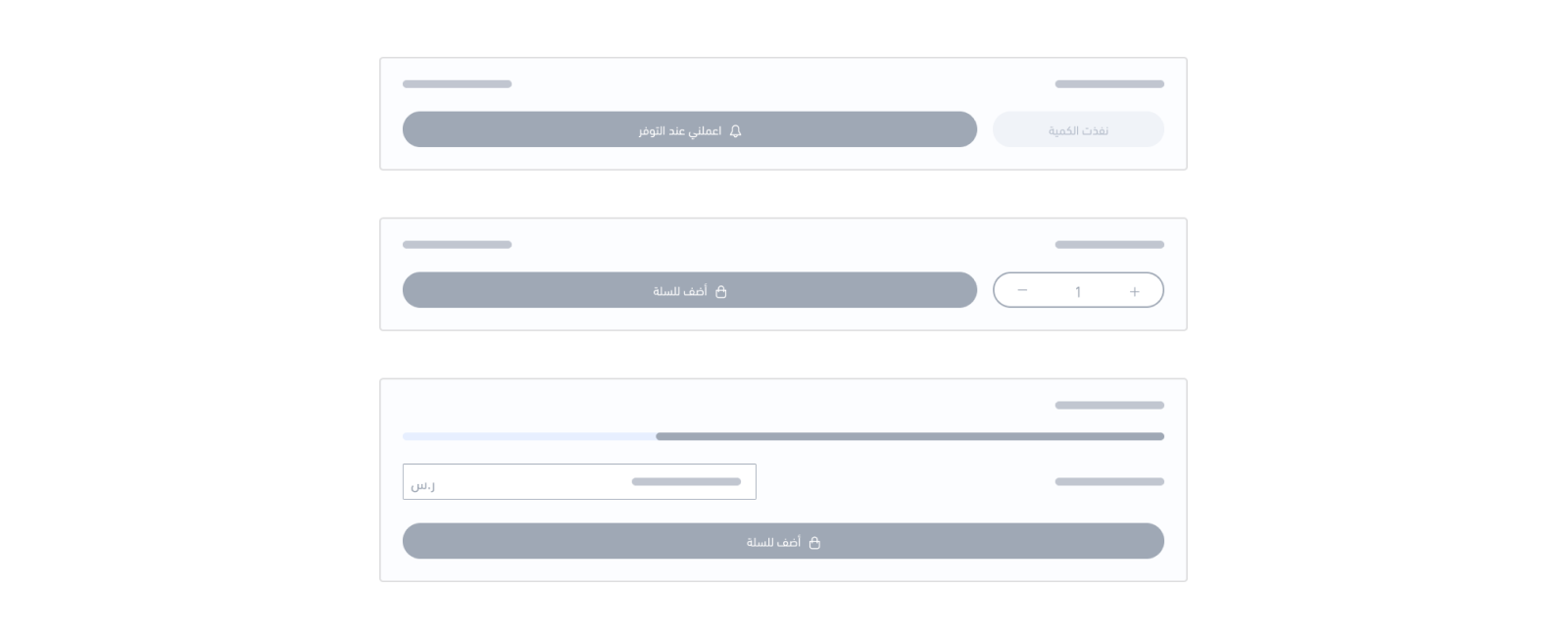
<salla-add-product-button> web component allows controllability over button text labels and behaviours based on the product-status and product-type properties. It consists of Product Availability component and Button component.Note
Example
Usage
HTML
JS
SASS
Properties
| Property | Attribute | Description | Type | Default |
|---|---|---|---|---|
| Channels | channels | Available notification channels | string | null |
| Donating Amount | donating-amount | Donation amount value | number | '0' |
| Notify Options Availability | notify-options-availability | Listen to Product Options availability. | boolean | |
| Product ID | product-id | Product ID under which the merchant can sign up for an availability notice | any | undefined |
| Product Status | product-status | Product status based on the allowed type values. | "out" | "out-and-notify" | "sale" | 'sale' |
| Product Type | product-type | Product type based on the allowed type values. | "codes" | "digital" | "donating" | "food" | "group_products" | "product" | "service" | 'product' |
| Quantity | quantity | Passing custom quantity number to be injected within the component, which affects sale product statuses as the Quantity Input component will be customized with the number passed. | number | '0' |
| Quick Buy | quick-buy | Support for the Quick Pay Button | boolean | undefined |
| Subscribed Options | subscribed-options | Shows the Subscribed Options ex: "[[139487,2394739],[1212,1544]]" | string | undefined |
| Support Sticky Bar | support-sticky-bar | Support for themes that have a sticky bar | boolean | undefined |
Note
out refers to the product being out of sale where a disabled button is labeled as "Sold Out". The out-and-notify type is where the Product Availbility component takes place as Merchants are allowed to subscribe when the specific product becomes available.sale is where the specified product is currently under sale which will allow for a Button component to appear and be labeled as "Add to Cart".product-type is set to donating, then the label Donate will appear when product-status is set to sale.Events
| Event | Description | Type |
|---|---|---|
failed | This event will be fired when the Add Product to the cart fails | CustomEvent<any> |
success | This event will be fired when the Add Product to the cart succeeds | CustomEvent<any> |
Fast Checkout Feature
Now, customers can complete their transactions using most common payment methods without needing to go to a different page. This approach aims to provide a seamless and convenient shopping experience in Salla Merchants’ stores for their customers.
• Apple Pay
• Credit cards (Visa, MasterCard, or Mada)
• Installment plans (Tabby and Tamara)
• Cash on delivery
Alert
salla-mini-checkout-widget {
--salla-fast-checkout-button-height: 2.5rem;
  --salla-fast-checkout-button-width: 100%;
  --salla-fast-checkout-button-border-radius: 0.375rem;
}

 扫码加入交流群
Modified at 2025-02-20 07:53:20