本文档由 Apifox 自动生成,推荐使用 Apifox - API 文档、API 调试、API Mock、API 自动化测试!

- Merchant API
- Welcome 👋
- Get Started
- Create Your First App
- Authorization
- Webhooks
- Conditional Webhooks
- Security Considerations
- Multi-Language Support
- Responses
- Pagination
- Rate Limiting
- Versioning
- Change Log
- Support
- APIs
- Orders
- Order Status
- Order Histories
- Abandoned Carts
- Order Tags
- Order Invoice
- Order Reservations
- Order Items
- Products
- Product Options
- Product Quantity
- Product Variants
- Product Tags
- Product Images
- Product Option Values
- Customer Groups
- Customers
- Digitals Product
- Categories
- Exports
- Shipments
- Shipping Companies
- Shipping Zones
- Shipping Rules
- Countries
- Product Option Templates
- Taxes
- Coupons
- Affiliates
- Order Assignment
- Special Offers
- Transactions
- Payments
- Settlements
- Settings
- Merchant
- Brands
- Reviews
- Branches
- Currencies
- SEO
- Cities
- DNS Records
- Languages
- Employees
- Advertisements
- Webhooks
- Custom URLs
- Loyalty Points
- Webhooks - Store Events
- Partner Apps APIs
- Shipping and Fulfilment API
- Twilight Themes
- Getting Started
- Requirements & Review
- Files and Folders Structure
- Twig Template Engine
- Theme Architecture
- Layouts
- Pages
- Componenets
- Overview
- Home Components
- Youtube
- Fixed banner
- Testimonials
- Parallax background
- Photos slider
- Store features
- Square photos
- Fixed products
- Products slider
- Featured products - Style 1
- Featured Products - Style 2
- Featured Products - Style 3
- Brands
- Enhanced Square Banners
- Main Links
- Enhanced Slider
- Slider Products with Headers
- Latest Products
- Vertical Menu with Slider
- Product Components
- Common Components
- Change Log
- Twilight JS SDK
- Twilight Web Components
- Salla CLI
- Schemas
- Response
- Merchant Responses
- abandondCart_response_body
- abandondCarts_response_body
- addCustomerToGroupCustomers_response_body
- advertisement_response_body
- advertisements_response_body
- affiliate_response_body
- affiliates_response_body
- availableCurrencies_response_body
- availableMethods_response_body
- branch_response_body
- branches_response_body
- brand_response_body
- brands_response_body
- categories_response_body
- category_response_body
- cities_response_body
- countries_response_body
- country_response_body
- coupon_response_body
- coupons_response_body
- currencies_response_body
- customer_response_body
- customerGroup_response_body
- customerGroups_response_body
- DNSRecord_response_body
- DNSRecords_response_body
- employees_response_body
- get_orderHistories_response_body
- get_orders_response_body
- get_orderShipment_response_body
- get_orderStatuses_response_body
- invoice_response_body
- order_response_body
- invoices_response_body
- orderStatuses_response_body
- orderTag_response_body
- orderTags_response_body
- post_orderHistories_response_body
- product_response_body
- productDigitalFile_response_body
- productImagesVideos_response_body
- productOption_response_body
- productTag_response_body
- shippingZone_response_body
- productValue_response_body
- review_response_body
- shipmentTracking_response_body
- ShippingRules_response_body
- shippingCompany_response_body
- shippingCompanies_response_body
- productTags_response_body
- products_response_body
- seo_response_body
- productVariants_response_body
- productVariant_response_body
- banks_response_body
- reviews_response_body
- shipment_response_body
- shipments_response_body
- shippingRulesDetails_response_body
- shippingZones_response_body
- specialOffer_response_body
- specialOffers_response_body
- storeInformation_response_body
- tax_response_body
- taxes_response_body
- userInformation_response_body
- webhook_response_body
- webhookEvents_response_body
- webhooks_response_body
- customers_response_body
- abandondCarts_response_body
- Languages_response_body
- bank_response_body
- WebhookV2Response
- draftedOrder_response_body
- ordersMessage_response_body
- templates_response_body
- printOrder_response_body
- listExportTemplates_response_body
- exportColumns_response_body
- ordersAutoAssignment_response_body
- orderAutoAssignment_response_body
- invoiceDetails_response_body
- bulkActions_response_body
- orderItem_response_body
- reservation_response_body
- WebhookV1Response
- transactions_response_body
- transaction_response_body
- childCouponCode_response_body
- product_option_templates_response
- settings_response_body
- slugSettings_response_body
- deletedProduct_response_body
- product_option_templates_details_response
- product_option_template_response
- product_option_template_details_response
- brandWithTranslations_response_body
- brandsWithTranslations_response_body
- categoriesWithTranslations_response_body
- categoryWithTranslations_response_body
- orderAssignedEmployees_response_body
- estimateRates_response_body
- shippingCompanyOptions_response_body
- orderDetails_response_body
- settlements_response_body
- settlement_response_body
- ListProductsLightFormat_response_body
- bulkProductActions_response_body
- productQuantities_response_body
- quantityAudit_response_body
- categoriesProducts_response_body
- loyality_response_body
- Success / Error Responses
- Merchant Responses
- Schemas
- Twilight Schemas
- components_variables_json_schema
- Contacts
- Copyright
- FooterMenu
- FooterMobileApps
- FooterPaymentMethods
- FooterSocial
- FooterPaymentMethods
- FooterSocialLinks
- Breadcrumb
- Breadcrumbs
- Currency_Switcher
- Header Header
- Language_Switcher
- Menu
- Menus
- Header_Notifications
- Header_Theme_Preview
- Home-Vertical-Menu-with-Slider
- HomeBrandsComponent
- HomeEnhancedSlider
- HomeEnhancedSquareBanners
- HomeFeaturedProductsStyle1
- HomeFeaturedProductsStyle2
- HomeFeaturedProductsStyle3
- HomeFixedBanner
- HomeFixedProducts
- HomeLatestProducts
- HomeMainLinks
- HomeParallaxBackground
- HomePhotoSlider
- HomeProductsSlider
- HomeSliderProducts
- HomeSquarePhotos
- HomeTestimonials
- HomeYoutube
- HomeStoreFeatures
- TestimonialComponents
- pages_variables_json_schema
- BlogCategory
- BlogListingPage
- BlogTag
- BrandsListingPage
- CartPage
- CustomerOrderPage
- CustomerProfilePage
- Global variables
- HomePage
- LandingPage
- LoyaltyPage
- NotificationsPage
- OffersPage
- OrderDetailsPage
- Page
- PageCommentsVaribles
- ProductPage
- ProductsListingPage
- SearchResultPage
- SingleBlogPage
- SingleBrandPage
- SinglePagePage
- SingleProductPage
- ThankyouPage
- WishListPage
- Customer Order Page
- NotificationsPage
- product_components_variables_json_schema
- js_api_payloads_responses
- auth
- booking
- cart
- latest
- Order Status
- Details
- Summary
- Quick Add
- Add Item
- Delete Item
- Delete Image
- Add Coupon
- Remove Coupon
- Get Upload Image
- Get Quick Order Settings
- Create Quick Order
- Get Current Cart Id
- Price Quote
- CartUpdateResponse
- cart.addItem.reponse.success
- CartSummary
- TwilightResponse
- CartUpdateResponse
- cart.details.reponse.error
- CartUpdateResponse
- cart.details.reponse.success
- cart.getCurrentCartId.response.success
- cart.quickAdd.payload
- cart.PriceQuote.reponse.success
- CartUpdateResponse
- cart.quickAdd.response.success
- cart.quickOrderSettingResponse.success
- cart.status.payload
- cart.status.success
- CartUpdateResponse
- AddItemPayload
- CartUpdateResponse
- comment
- common
- coupon
- currency
- gift
- loyalty
- order
- product
- Get Price
- Product Availability
- Offer Details
- Search Products
- Categories
- Get Gift Details
- Add Gift To Cart
- Upload Gift Image
- Get Product Details
- Fetch
- Fetch Options
- Size Guides
- product.payload
- product.categories.Response.success
- product.getDetails.Response.success
- product.getPrice.payload
- product.getPrice.response.error
- product.getPrice.response.success
- ProductDetail_Model
- profile
- rating
- wishlist
- reviews
- menus
- Error_CodeMessageField_Response
- Error_CodeMessage_Response
- models
- Article
- Brand
- Cart
- CartItem
- Category_Products_Listing
- Category Page
- Collection
- Comments
- Order
- Rating
- Store
- StoreBlock
- StoreCurrency
- StoreGiftImage
- StoreGiftText
- StoreTheme
- Tag
- Theme
- TwilightConfig
- User
- ProductOption
- ProductOptionDetails
- Notification
- Product
- Feedback
- Offer
- Twilight JS SDK - List of the available configurations
- Category
- components_variables_json_schema
- Merchant Schemas
- Webhook Events
- Customers OTP (One-Time Password) Webhook Event Model
- Store Branch Webhook Event Model
- Review Added Webhook Event Model
- Coupon Applied Webhook Event Model
- Special Offer Webhook Event Model
- Store Tax Webhook Event Model
- Product Webhook Events Model
- Customer Webhook Events Model
- Category Webhook Events Model
- Brands Webhook Events Model
- Abandoned Cart Webhook Event Model
- Shipping Zone Webhook Model
- Shipping Company Webhook Model
- Orders Webhook Events Model
- Order Shipments Webhook Events Model
- Order Shipment Cancelled Webhook Events Model
- Orders Status Updated Webhook Events Model
- Shipments Webhook Events Model
- Invoice Created Webhook Event Model
- Abandoned Cart Status Changed Webhook Event Model
- Abandoned Cart Purchased Webhook Event Model
- Products Channel Changed Webhook Event Model
- Errors
- Base Models
- Customer
- CustomerGroup
- Tax
- Webhook
- Payment
- Product
- ProductValue
- Brand
- SpecialOffer
- Branch
- Country
- City
- Pagination
- OrderStatus
- ProductDetails
- ProductOption
- OrderTag
- Order
- OrderCard
- CountryCard
- CustomerGroupCard
- Date
- ProductCard
- ListOrders
- Urls
- Invoice
- OrderStatus
- ProductVariant
- ShippingCompany
- ShipmentBranch
- Coupon
- Affiliate
- DNS
- Banks
- Advertisement
- ListOrderStatuses
- OrderShipments
- POSTOrderHistory
- ProductDigitalFile
- Shipment
- Languages
- AbandonedCart
- Reviews
- ProductTag
- StoreInformation
- ProductImagesVideos
- ShipmentTracking
- ListOrderHistories
- ShippingZone
- UserInformation
- OrderStatuses
- ShippingRules
- Currencies
- AvailableCurrencies
- Employees
- SEO
- Events
- CustomerGroupFeatures
- AccessToken
- RefreshAccessToken
- MiniProductOption
- OrderStatusUpdatedEventOrderObject
- OrderAutoAssignment
- InvoiceDetails
- BulkActions
- NewOrderStatus
- OrderLight
- OrderItem
- Reservation
- Transaction
- ChildCouponCodes
- CategoriesProducts
- OptionsTemplate
- Advertisement
- Category
- OrderItem
- OrderDetails
- ListProductsLightFormat
- DeletedProducts
- BrandWithTranslation
- EstimateRates
- Settings
- CategoryWithTranslation
- AbandonedCartWebhook
- BulkProductActions
- ProductQuantities
- QuantityAudit
- Settlement
- OptionsTemplateWithDetails
- Loyalty Points
- shippingCompanyOptions
- OrderAssignedEmployees
- Cursor
- Webhook Events
- Partner Apps Schemas
- Shipping and Order Schemas
- Twilight Schemas
- Request Bodies
- Merchant Requests
- addCustomerGroup_request_body
- advertisment_request_body
- affiliate_request_body
- branch_request_body
- DNSRecord_request_body
- coupon_request_body
- invoice_request_body
- customer_request_body
- brand_rquest_body
- post_customSubStatus_request_body
- put_updateStatuses_request_body
- productImage_request_body
- put_shipmentDetails_request_body
- productVariant_request_body
- productOption_request_body
- category_request_body
- shipment_request_body
- productQuantity_request_body
- put_orderShipment_request_body
- productOptionValue_request_body
- productVideo_request_body
- webhook_request_body
- put_coupon_request_body
- put_product_request_body
- shippingZone_request_body
- tax_request_body
- post_coupon_request_body
- specialOffer_request_body
- seo_request_body
- customerGroup_request_body
- put_productOption_request_body
- post_productOption_request_body
- updateDefaultGroup_request_body
- product_request_body
- order_request_body
- post_order_request_body
- exportTemplate_request_body
- orderAutoAssignment_request_body
- orderItem_request_body
- sortOrderStatus_request_body
- bulkActions_request_body
- updateTransaction_request_body
- Sample Example - Order / Shipment Status
- updateBulkQuantity_request_body
- bulkProductActions_request_body
- add_loyalty_points_request
- exportProducts_request_body
- settings_request_body
- bulkEditor_request_body
- updateWebhook_request_body
- product_option_template_request_body
- Merchant Requests
- Response
Button
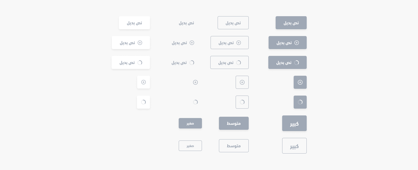
<salla-button> web component shows a customizable button, in terms of size, color, style, status, position etc ,which can be used with any other web component, and that can be customized using the properties' parameters available.Example#
Usage#
HTML
JS
SASS
Properties#
| Property | Attribute | Description | Type | Default |
|---|---|---|---|---|
| Color | color | Customized Button color | "danger" | "dark" | "gray" | "light" | "primary" | "success" | "warning" | 'primary' |
| Disabled | disabled | Button disability status | boolean | 'false' |
| Fill | fill | Button fill style | "none" | "outline" | "solid" | 'solid' |
| href | href | Button with a link capability | string | undefined |
| Loader Position | loader-position | Set the loading animation's position | "after" | "center" | "end" | "start" | 'after' |
| Loading | loading | Activate Button loading | boolean | 'false' |
| Shape | shape | Button type Configs | "btn" | "icon" | "link" | 'btn' |
| Size | size | Button size Configs | "small" | "medium" | "large" | 'medium' |
| Width | width | Button extends the full available width | "normal" | "wide" | 'normal' |
Methods#
methods allow for calling functions built by Salla to carry out certain actvities, such as enable and/or disable loading the component.| Method | Description | Return Type |
|---|---|---|
disable() | Inactivates the button by adding disabled attribute. Visually, it becomes unclickable and unhoverable. | Promise<void> |
enable() | Activates the button by removing disabled attribute. | Promise<void> |
load() | Runs loading animation to notify a user that there is a processing taking place. | Promise<HTMLElement> |
stop() | Stops loading animation after a process has completed | Promise<HTMLElement> |
setText(html: string) | Customizes the button's body text | Promise<HTMLElement> |

扫码加入 Apifox 微信交流群
在这里,获得 Apifox 使用上的任何帮助,快速上手让你的研测效率得到大幅提升

 扫码加入交流群
Modified at 2025-02-20 07:53:20